
After, the chosen design.
The Client
Since its creation in 1966 and connecting its first cable customer in 1971 in Sherwood Park, Alta. the Shaw family of companies has grown to become Western Canada’s leading network and content experience company, delivering the highest quality consumer, business and content product offerings.
Since Shaw's beginning as a cable company in Edmonton, it has expanded its network and the number of products and services they offer.
Project Summary
I was commissioned by Gloo Studios to present 3 proposals to redesign the screen for the elevators in Coal Harbour’s Shaw Tower. The client wanted "a modernized look, possibly turning the photos into illustrations". The new design should feel "slick, expensive and high-end".
The screens had to include: a Feature Information Feed, a RSS News Feed and a RSS Weather Feed.
The next image is the picture of the screen that required some updating. I could see some problems right away:
The Shaw logo was not big enough, the black rectangular background added a big area of darkness around the photos and made them look as if the image hadn't been delivered at a proper size, it looked even worse with vertical pictures.
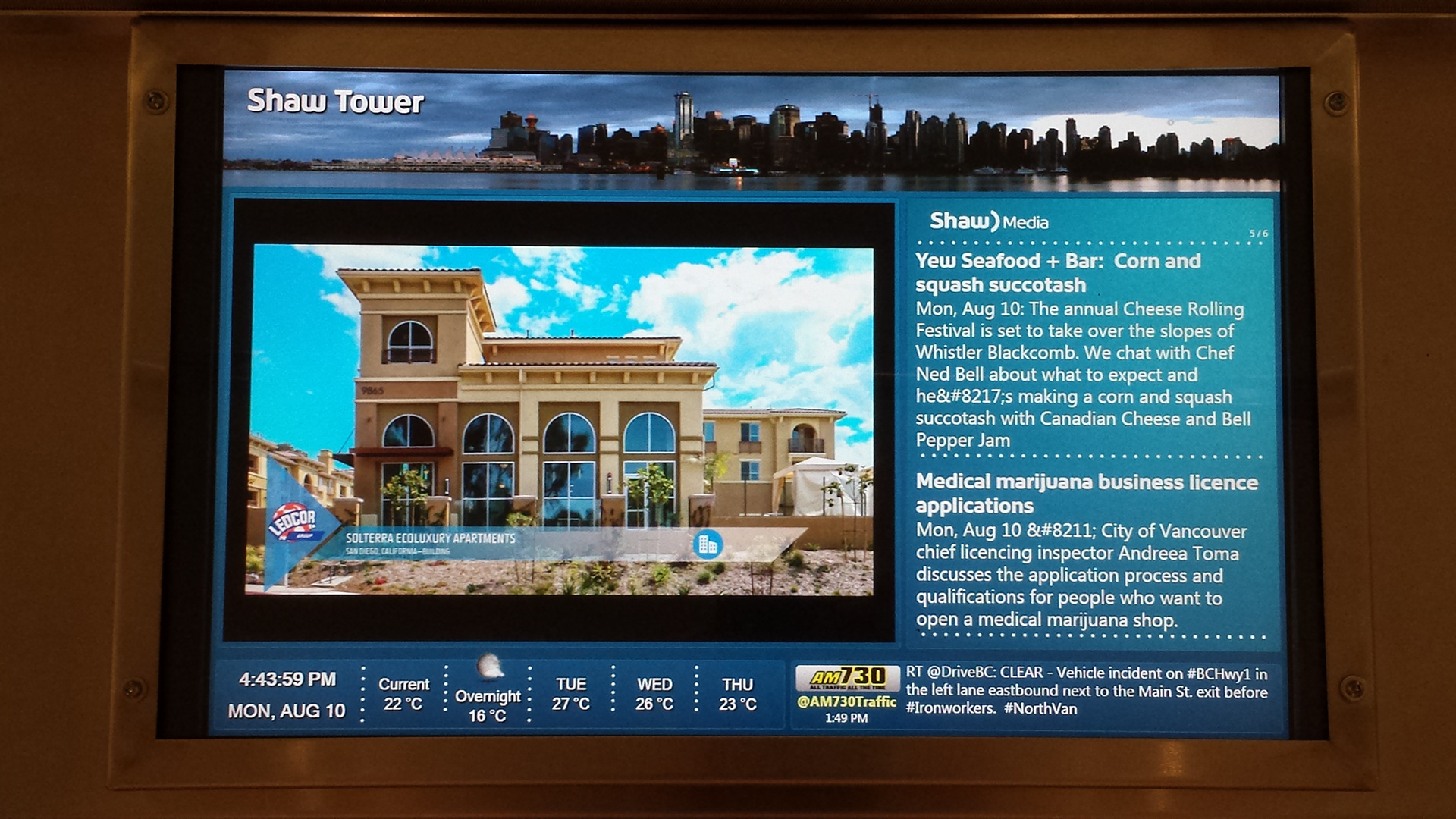
Before
What I did
Concept, UI Design, custom weather icons.
Design Process
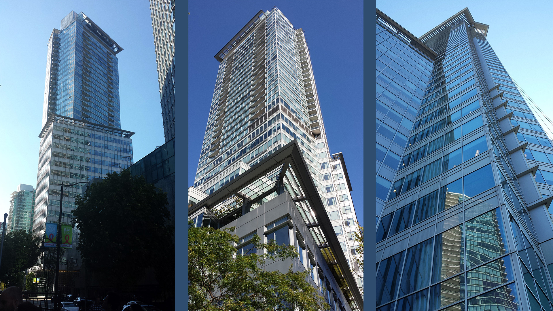
To get some inspiration I decided to go see the building. When I design I don't like to take inspiration out of nowhere. A design looks well-integrated when it is aesthetically similar to the place where it's going to be displayed. So I went to see the screens by myself and the building as well, both outside and in the lobby to gather some clues for the design direction.
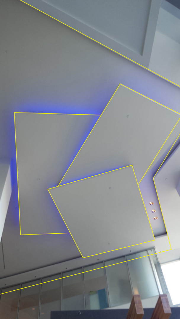
This shapes on the lobby's ceiling caught my attention, I thought I could use them in some interesting way. Which I did, I used them as the shapes for the background to have some transparent elements breaking the monotony of an all blue background. Also, I thought that in the future if the client decided to add animation to the screen, those elements would work very well for that purpose. Kind of like what you see in news channels, the main elements with the information can be static but there some subtle movements happening around.
The Solution
They requested 3 looks, but I went beyond and designed 4. This one was the selected one to be displayed inside the elevators. I was very proud that Shaw liked my designs that I decided to go back a few weeks later to see it on display and to take pictures of it. People looked at me oddly, wondering why someone was taking photos of the elevator’s TV!