The Client
Coyote Rental Solutions is a company that originated from the need of renters to build credibility when you don’t know anyone in a new city. The client came up with the idea drawing from his own experience moving from one city to another in Canada and discovering he didn’t know anyone who could vouch for him as a reference, he had no renting history, his reference letters from a place across the country were not credible. It was like starting a credit score from zero.
And from the need of landlords to spare them from housing bad tenants. Another strong motivator to kick-start his idea was his mother’s experience as a landlord because she had experienced a lot of bad dwellers.
Project Summary
- For tenants: Finding them a place to live and build their reputation.
- For the landlords: Finding them a good tenant, and also to get credibility.
- To create a platform where tenants and landlords can build their reputation, be seen as good people with other supporting elements besides recommendations.
- Bring a social feel to the rental industry, a community that everyday renters and tenants can utilize.
- A tool that will be accessible to everyone, firstly starting with Canada.
What I Did
In my team of 5 people, 3 User Experience Designers (UX) and 2 User Interface designers (UI) I collaborated in the following UX stages:
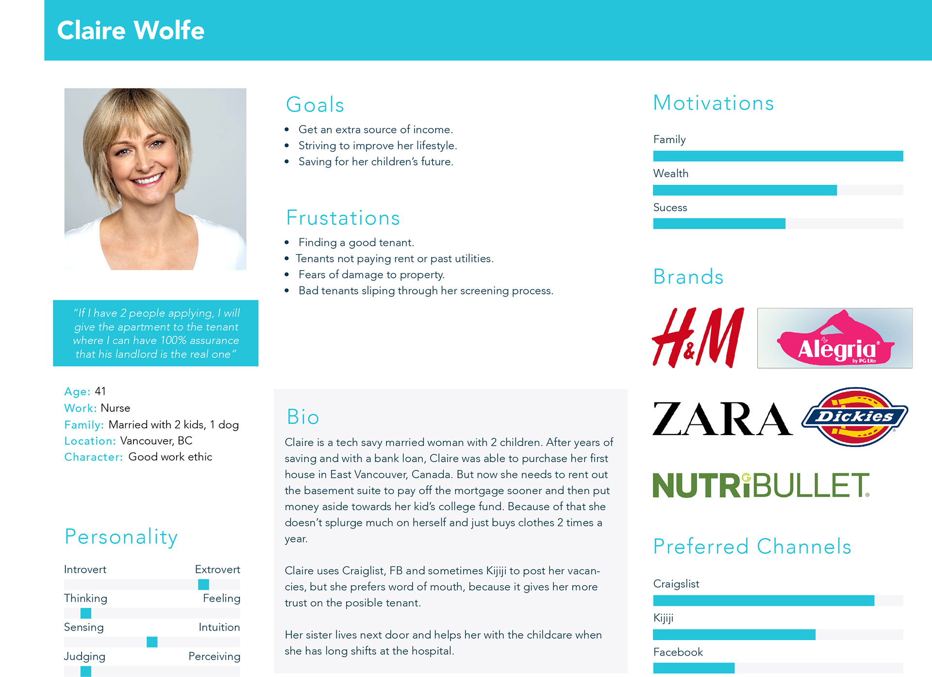
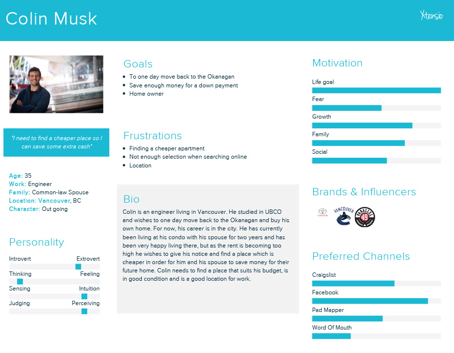
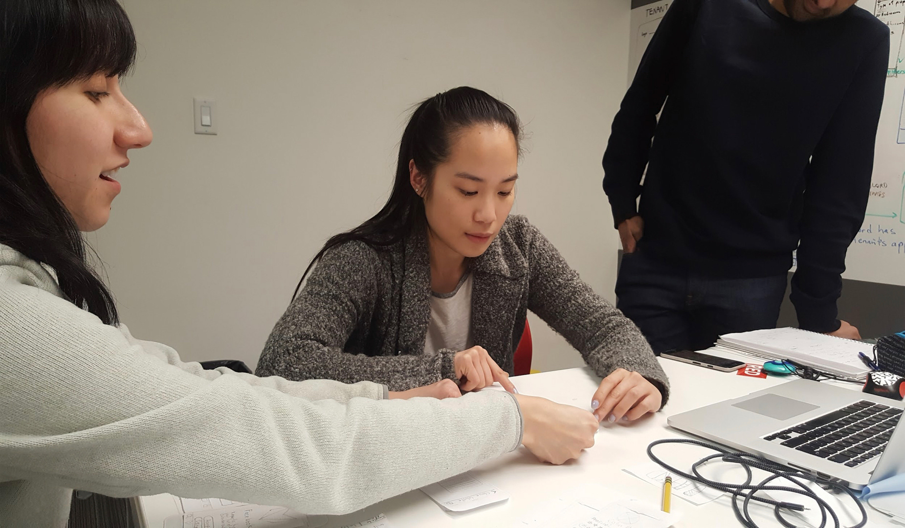
Interviewed client, creating and distributing surveys, user interviews, affinity diagrams, creating user personas, feature prioritization, user flows, sketching screens, designing paper prototypes, user testing, iterations (design modifications), wireframes (convert paper screens to digital screens), InVision prototypes for mobile, pitch to developers to get chosen for development, presenting to client, instructors and developers.
Design Process
From the research phase, after interviewing target users and sending out surveys, my team and I collected the data and these were the key findings:
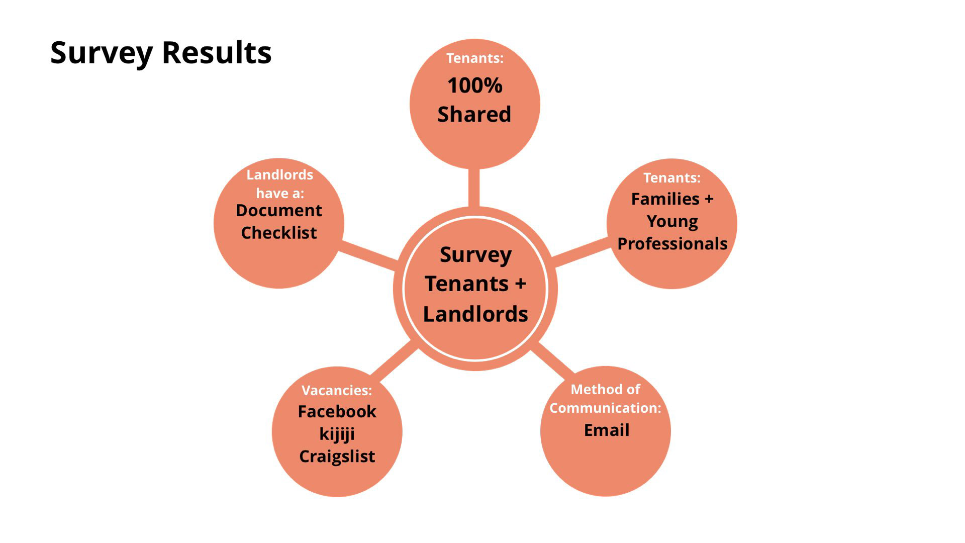
After interviewing target users and collecting the surveyed results.
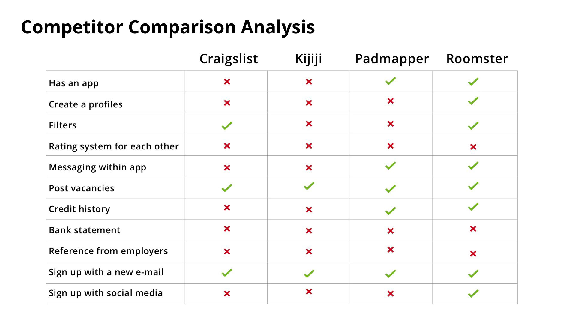
We also analyzed the competition out there. Craiglist and Kijiji were selected because they were mentioned the most in the surveys. Padmapper was mentioned as used by at least 3 of the interviewees and Roomster was discovered later on by a member of my UX team, it is an app that has many of the functionalities that we had already thought to include in the Coyote rental app.
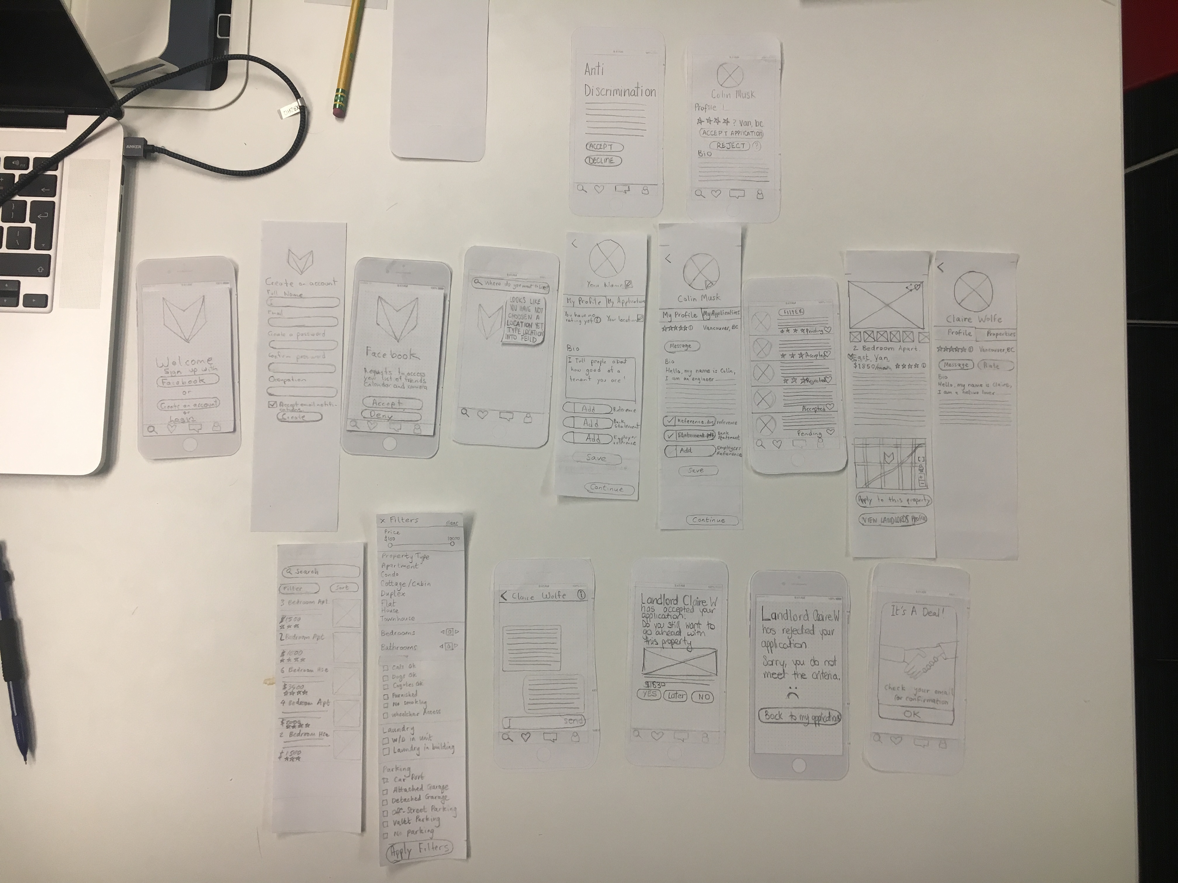
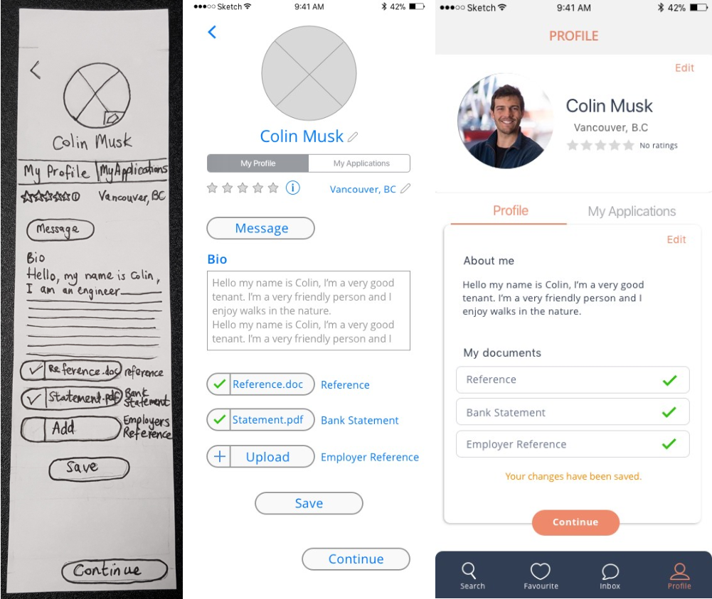
Traditionally user flows are made with texts and arrows but in this case we decided it was easier to start creating rough sketches of the screens, so we could literally see the flow of one button taking you into another screen, and visualize the order of the screens and how one screen could take into 2 different paths depending on the user's decision.
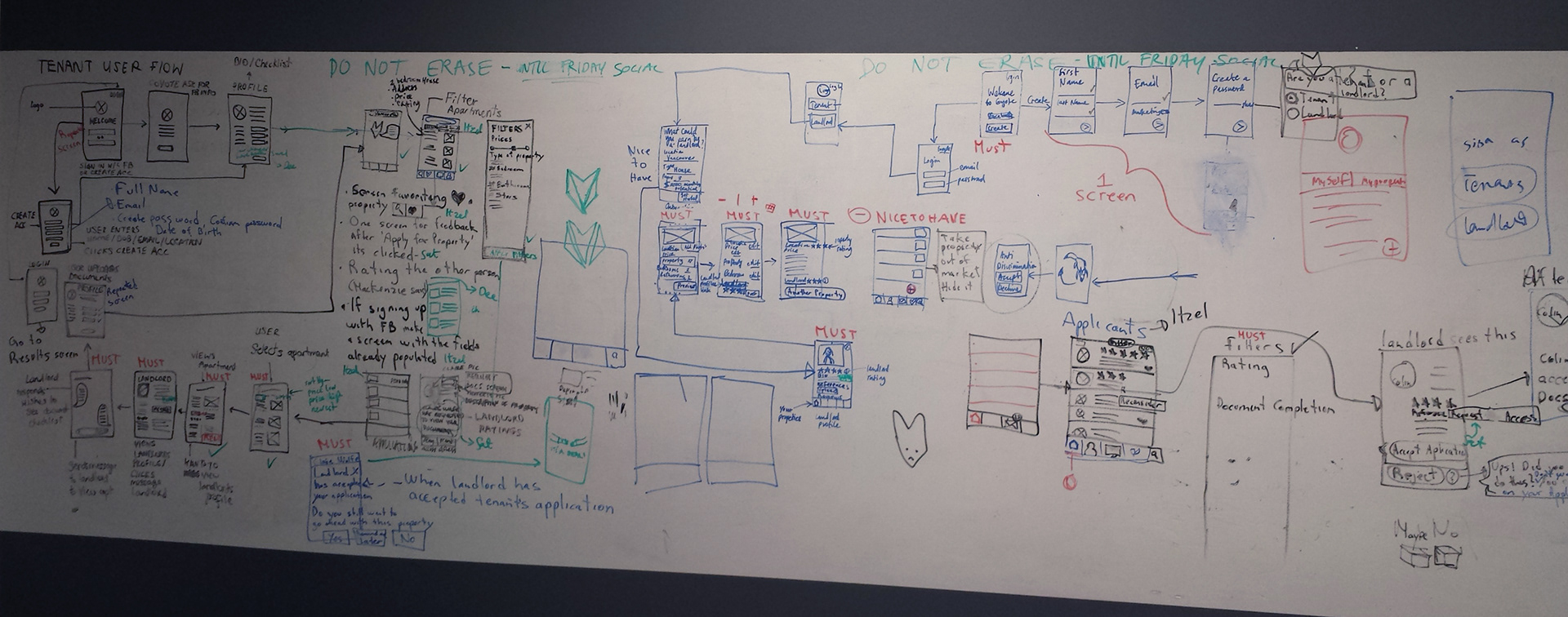
We used the whole whiteboard to sketch out the screens before drawing them in more detail in paper.
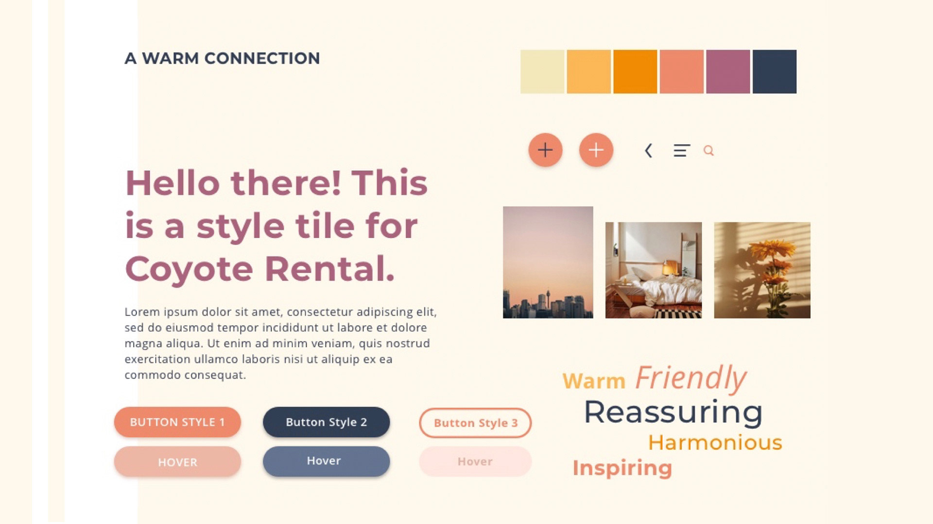
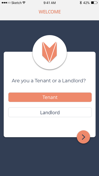
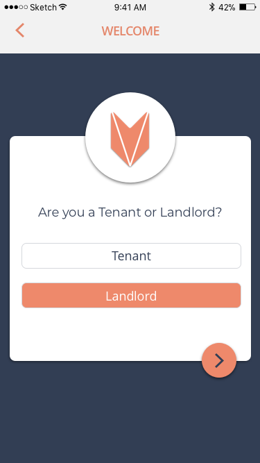
The Solution
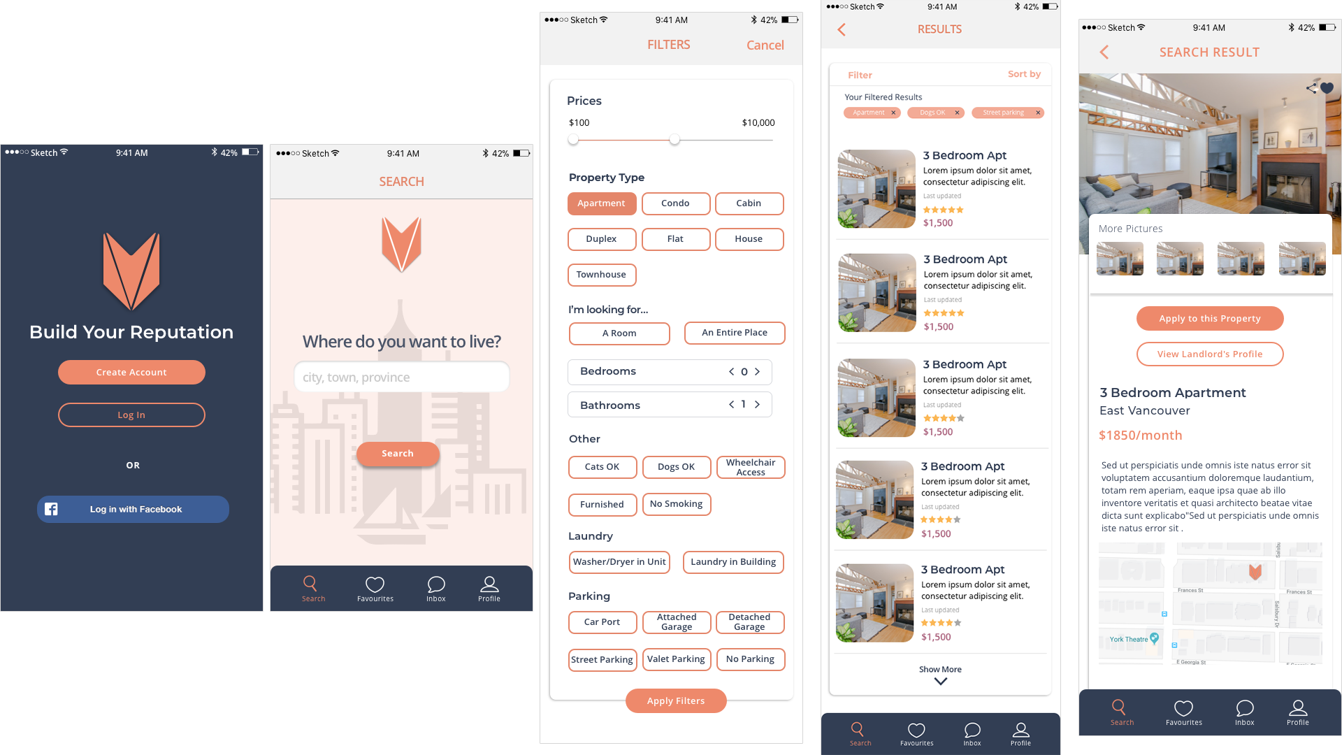
Some of the screens created.
Prototypes
Be sure to click on both images below to look at the prototypes in action!