The Client
LincEdge is an online platform that exposes available skilled capacity, otherwise not visible. Easily source both unexpected and expected labour requirements while building a private network of trusted partners in order to maintain a stable workflow.
LincEdge’s mission is "to create and grow a network for owners of skilled trade businesses and freelancers, making it safe to connect, source and share labour as needed.” The purpose of having a private network of contacts is that people who would like to join would have to be evaluated by a third party in order to only have reliable, credible and trustworthy people to work with.
Project Summary
- Make the website more appealing and informational for users to keep reading and decrease the bounce rate.
- Allow users to understand what the company does, that LincEdge's main product is an app, that it will be available to download soon for iOS and Android and is meant to be used for skilled trades business owners and freelancers.
- To offer enough information for the users to decide to download the app or at least to contact LincEdge for more information.
- Include testimonials from current users to grow credibility.
- Create a link to an external blog.
What I Did
In my team of 5 people, 3 User Experience Designers (UX) and 2 User Interface designers (UI) I collaborated in the following UX stages:
Interview to client, creating and distributing survey, user interviews, customer journeys, social media channels analysis, affinity diagram, creating the user persona, feature prioritization, sketching screens, designing paper prototypes, user testing, A/B testing, iterations (design modifications), wireframes (convert paper screens to digital screens), InVision prototypes for desktop and mobile responsive, pitch to developers to get chosen for development, presenting to client, instructors and developers.
Design Process
We reviewed the google analytics of the current website to discover information that could be useful to design. The graph below is a summary of the view per page, it gave is an idea of how which pages were the most and least visited and how long users viewed them for. We discovered the website had high bounce rates.
Page Views Summary on Google Analytics. Informs about the engagement of users on each page.
The customer journey is a technique used to get information from people by asking them to go on a website while sharing out loud with us the UX designers what they are thinking while navigating it. We wanted to gather their thoughts, opinions, confusions, frustrations while looking at the website, so we could find the areas were we could improve the experience (the pain points on the website).
This a user flow which is basically how the user navigates from point A to B, or in this case there was a point C, 2 possible decisions to choose from.
User flow with 1 entry point and 2 exit points marked with turquoise color.
This was the user persona created from real data from the interviews, Google Analytics and the customer journeys.
This are 3 different sketches made by 3 designers for the About page during a process called "Design Studio" further explained in the Case Study. After having all the screens sketched we put them in order and we had our paper prototype right there! Now ready to go test it on some users.
We tested our paper prototype with people based on those we had to do some iterations (modifications). Also in some cases were we couldn't decide which option was the best, we let the people indicate us their preference and the reasons why. Then we did more iterations. In total we conducted 14 tests, obtaining over 5 pages of data from our users.
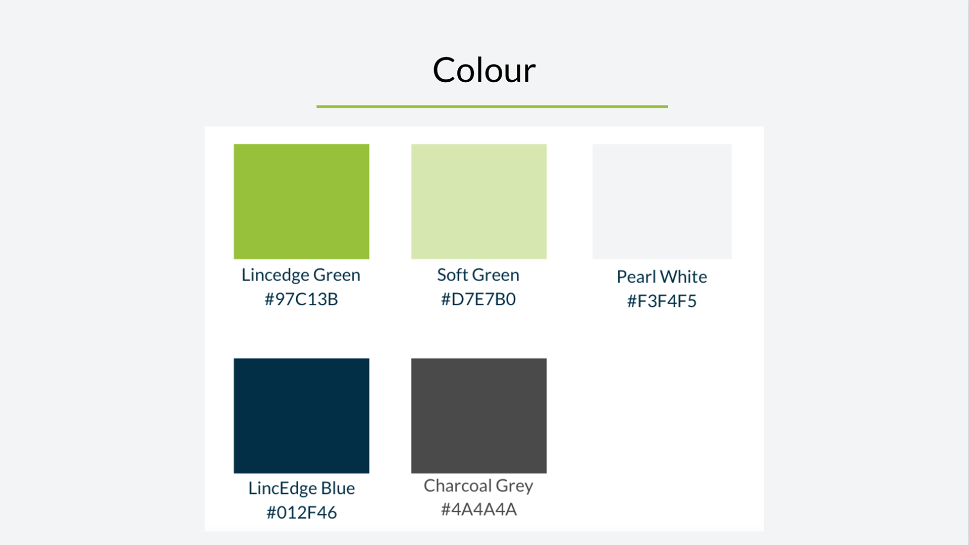
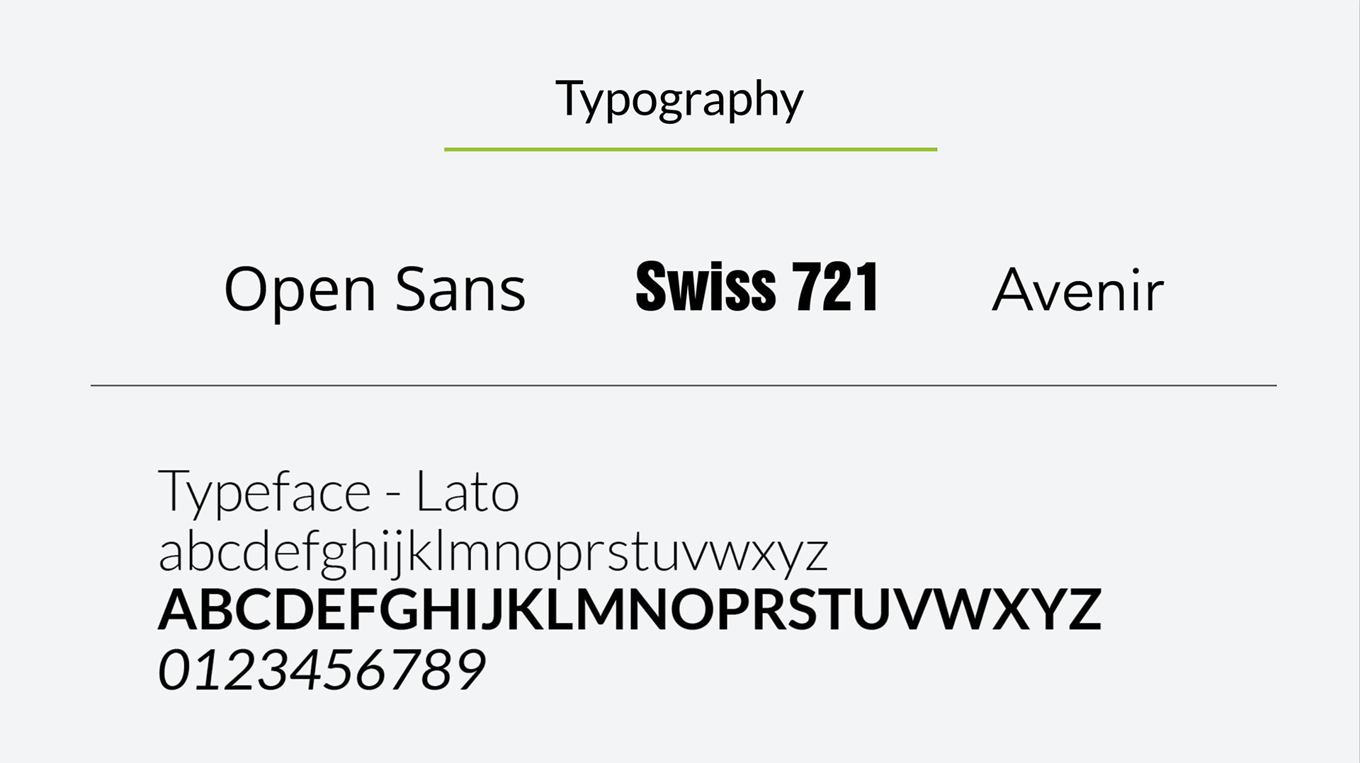
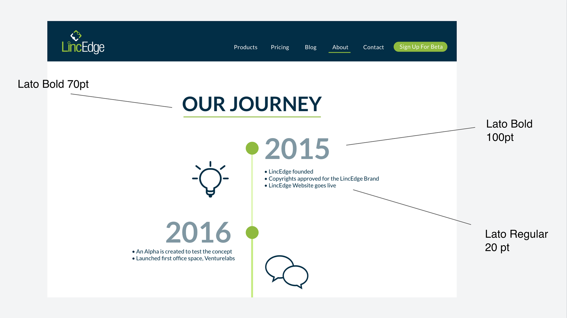
While the UX designers were doing all the process mentioned above, the UI designers were on the tasks of developing 2 art directions for the client to pick one and base their design in that one. From there they came created the color palettes and decided on the typographies to be used on the entire website. That way when we had completed digitizing the paper sketches, meaning creating the wireframes, they were ready to start applying the art direction on top of those wireframes.
The Solution
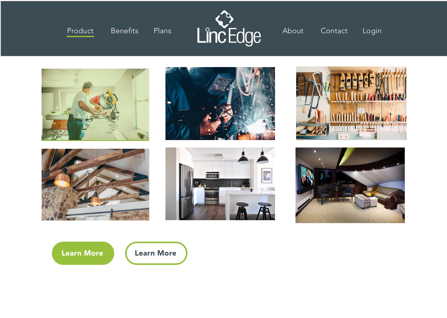
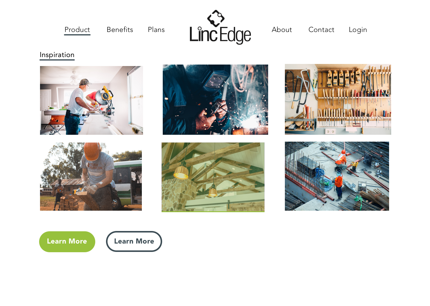
The evolution of one screen from start to finish, from low-fi (paper) to hi-fi (digital).
Prototypes
Check out all the screens in action in the clickable prototypes. Made in InVision.
